Astute Business Consult
Astute Business Consult
Timeline
- 1 month
My Role
- As the sole UX designer, I spearheaded the entire design process from conceptualization to execution. My responsibilities included conducting research, ideation, wireframing, prototyping, and creating the design system and brand identity.
Tools
- Figma
- Miro
- Photoshop
Project Overview
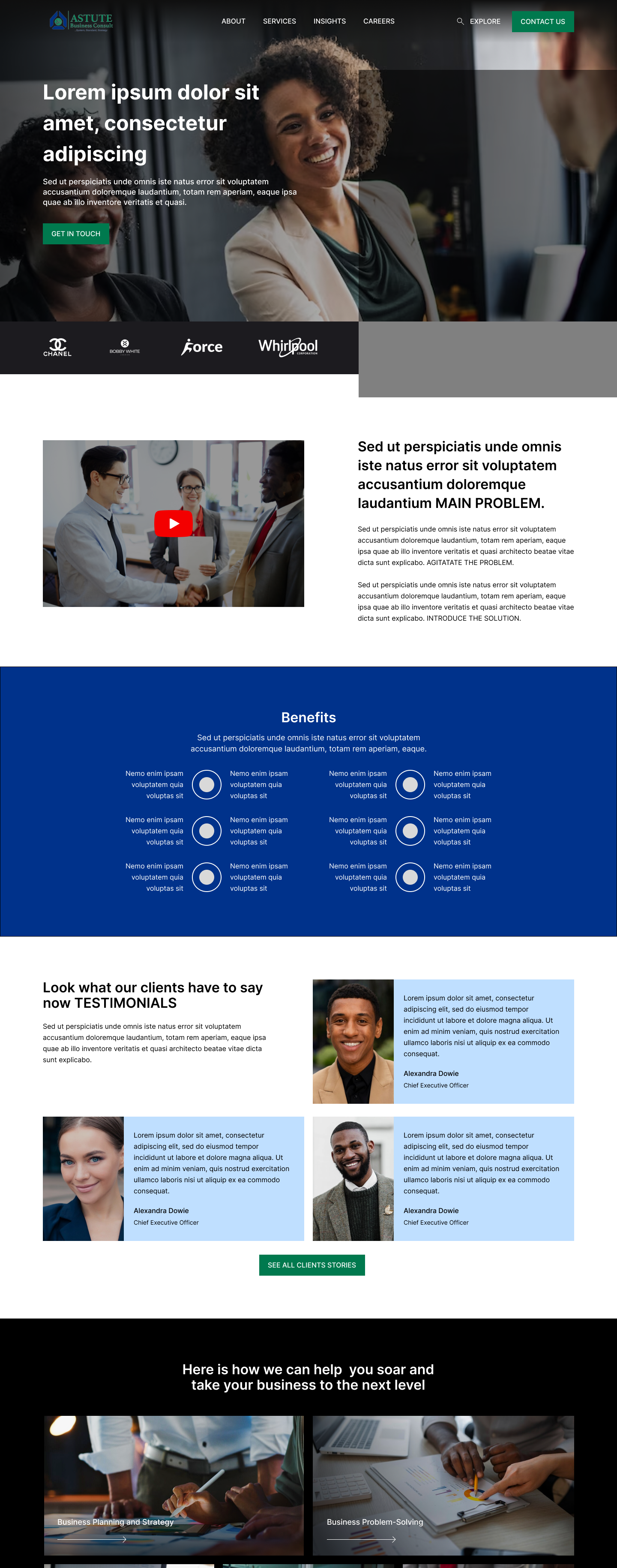
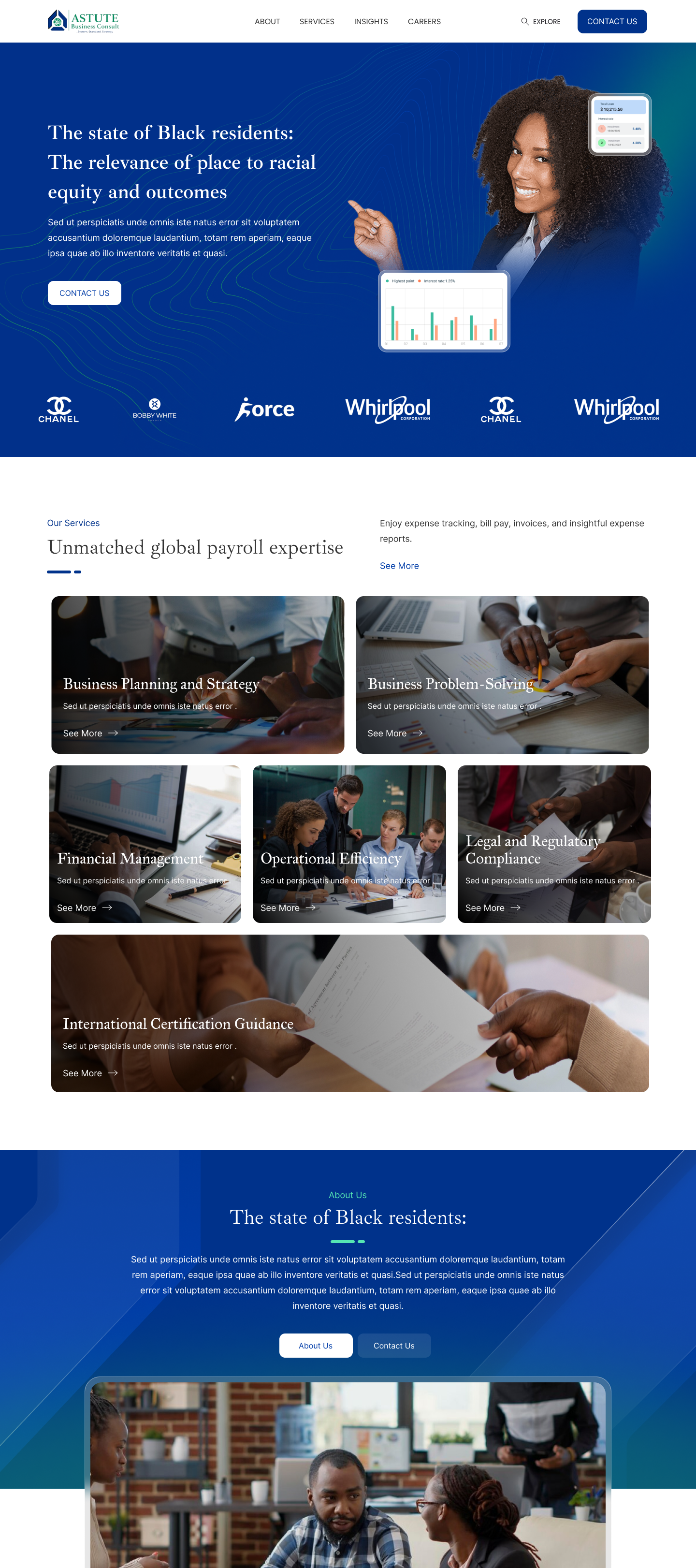
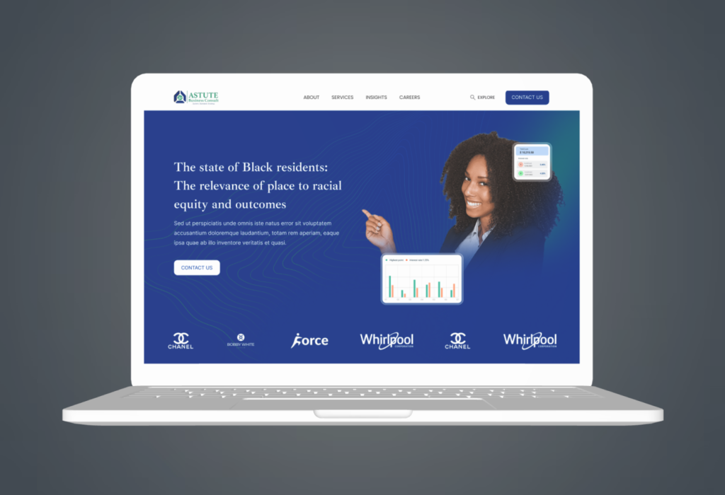
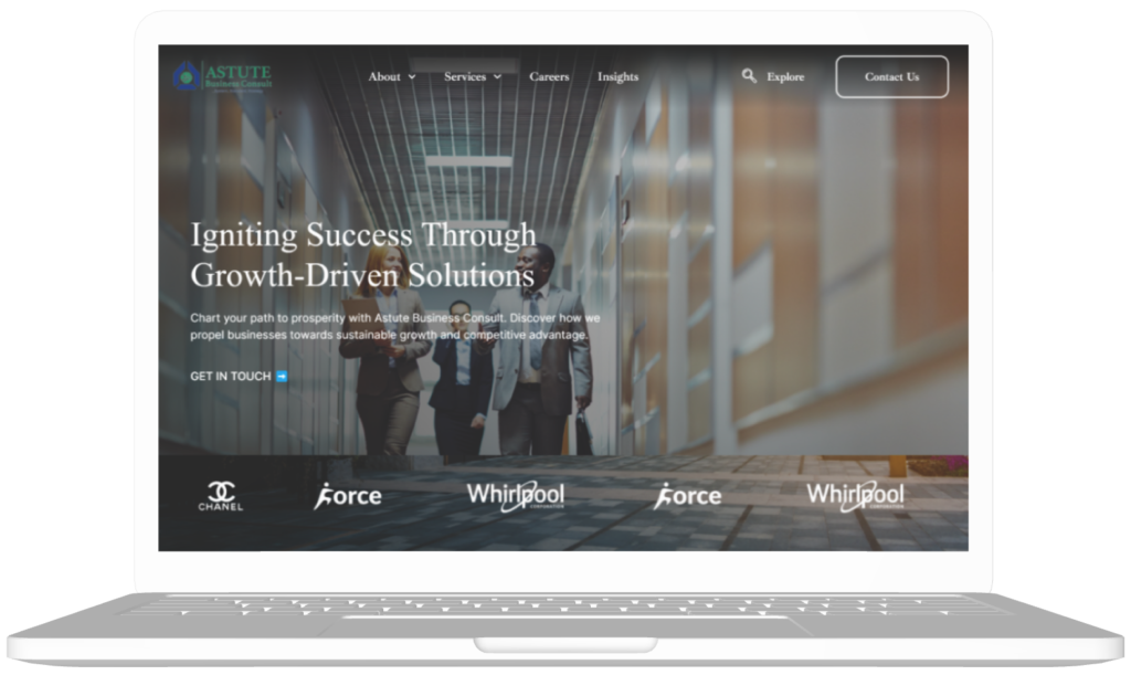
Astute Business Consult sought to establish itself as a leader in the business management consulting field through a comprehensive website redesign. The project aimed to create a professional and credible online platform that informs, engages, and captures leads while reinforcing the brand’s identity. The company partnered with me to revamp their website, emphasizing clarity, engagement, and lead generation. The goal was to create a user-centric platform that effectively communicates the company’s mission, values, services, and expertise.
The Problem
The existing website lacked coherence and failed to convey Astute’s expertise effectively. It lacked essential features such as lead capture forms, customer support resources, and a blog section for industry insights.
The Solution
We conducted thorough research to understand Astute’s goals, target audience, and industry standards. Based on insights gathered, we developed a strategic plan to redesign the website with a focus on user experience, content organization, and visual appeal.
Goals
- Establish a professional and credible online presence.
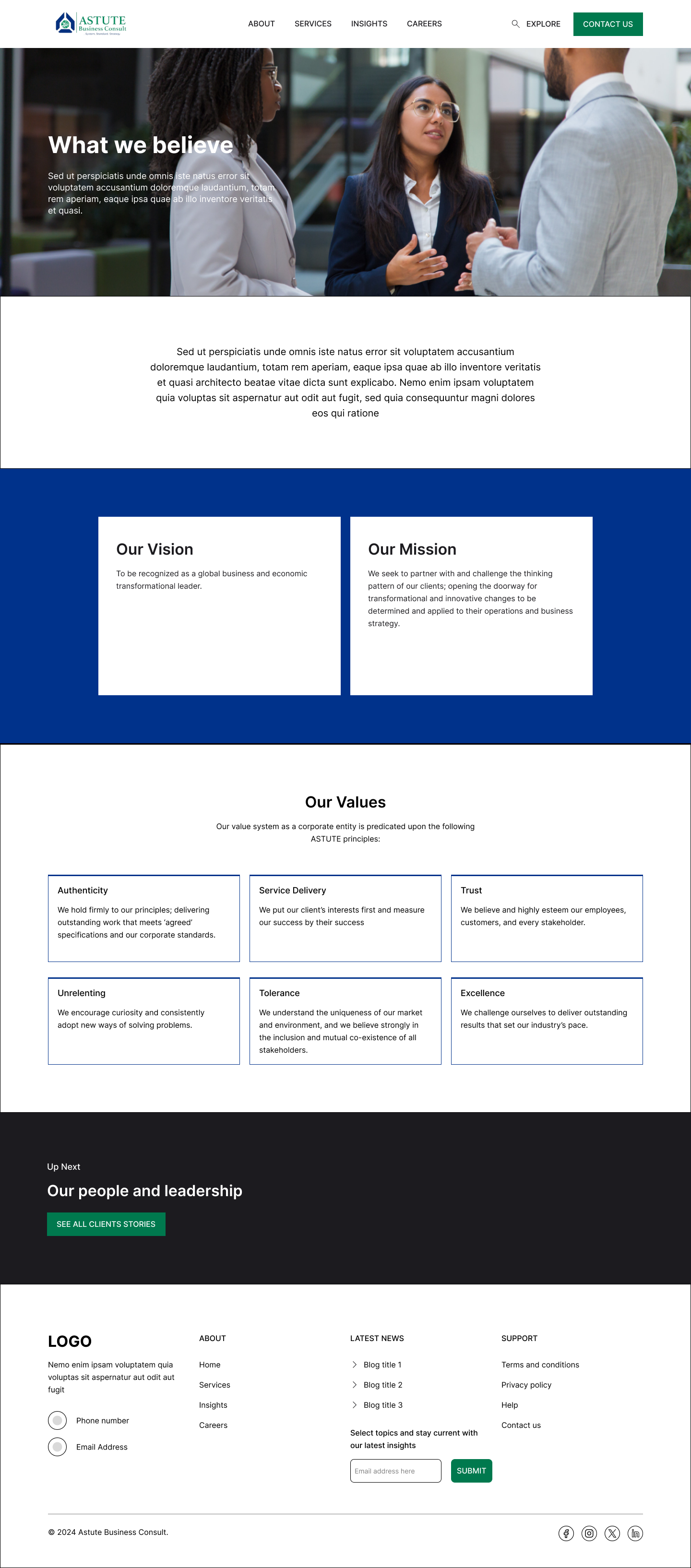
- Inform visitors about Astute’s business, mission, values, and history.
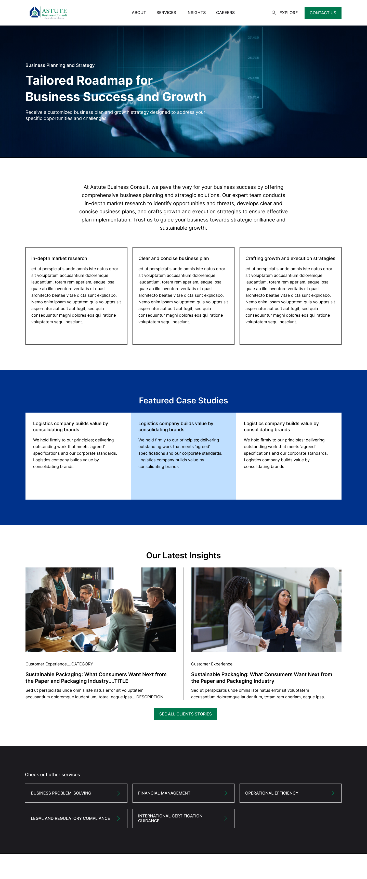
- Showcase services, products, and industry expertise effectively.
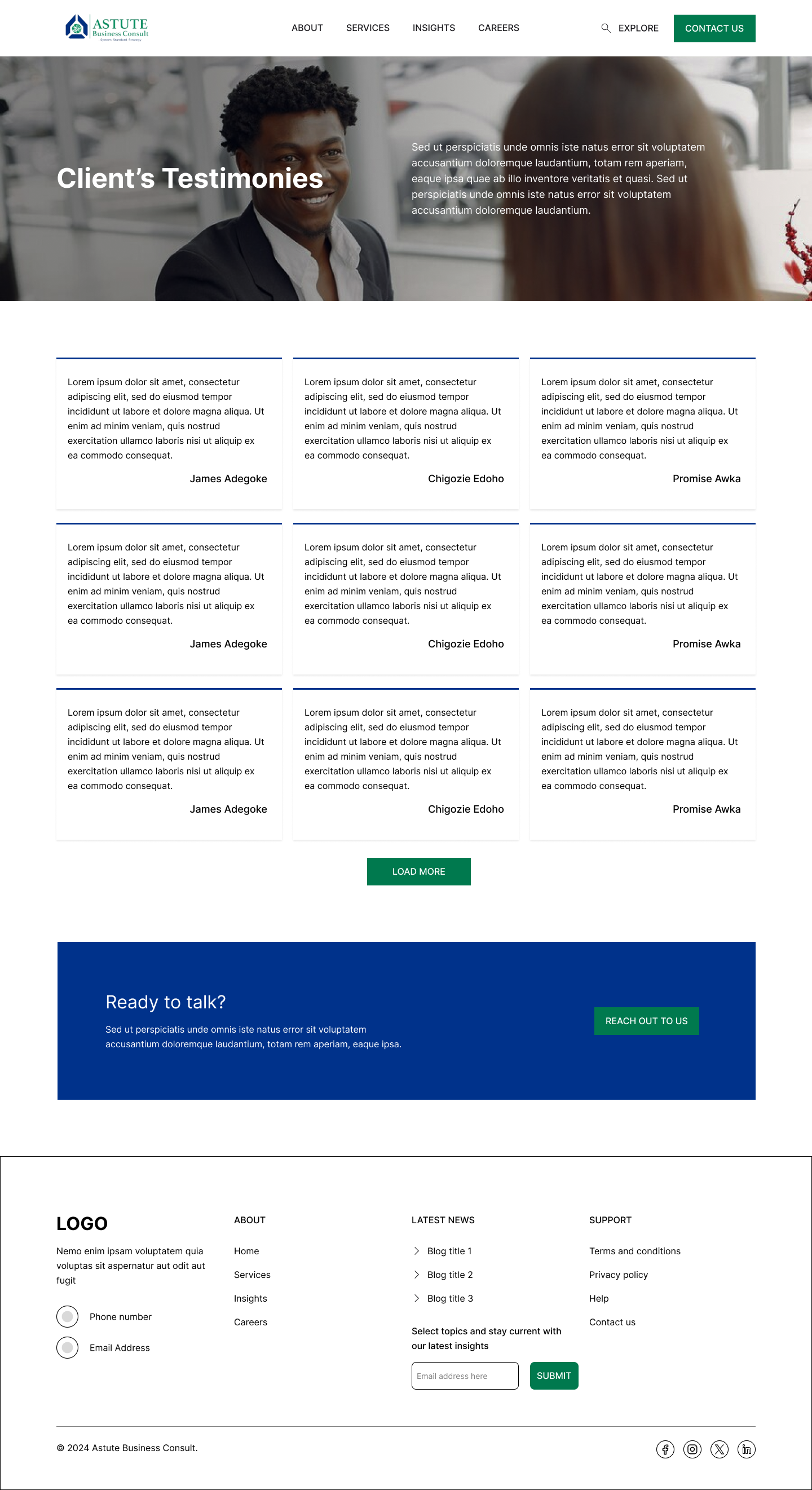
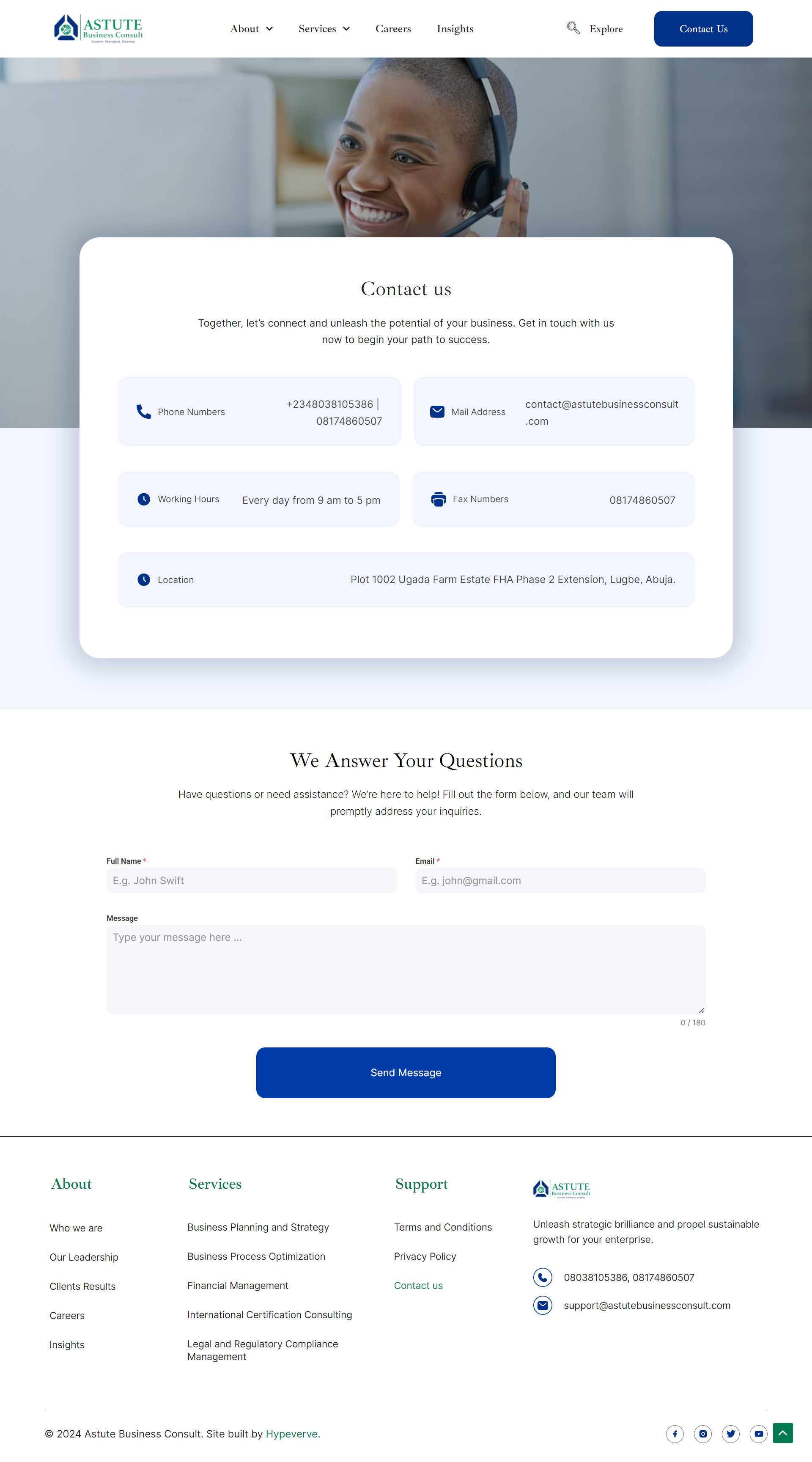
- Capture leads through contact forms and newsletter sign-ups.
- Provide customer support resources, including FAQs and contact details.
- Share valuable industry insights through a blog/resource section.
- Reinforce brand identity through consistent design and messaging.
- Ensure mobile optimization for seamless access on smartphones and tablets.
Research
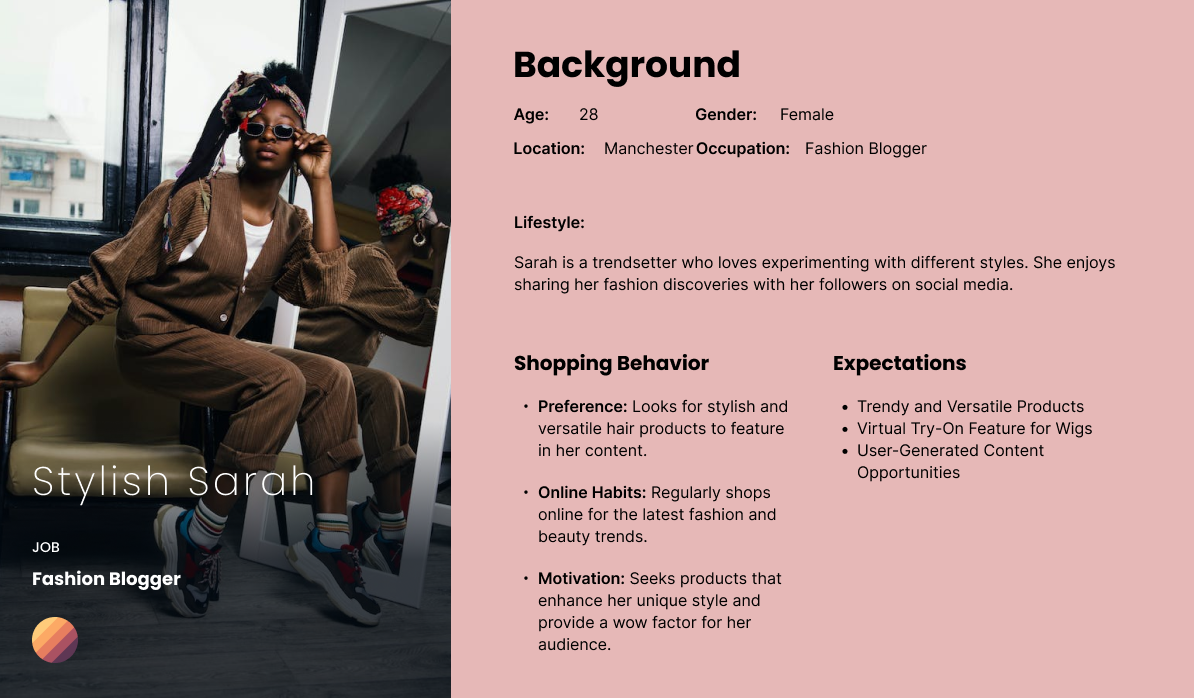
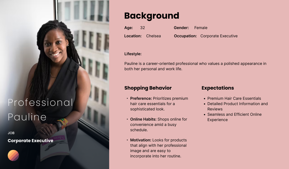
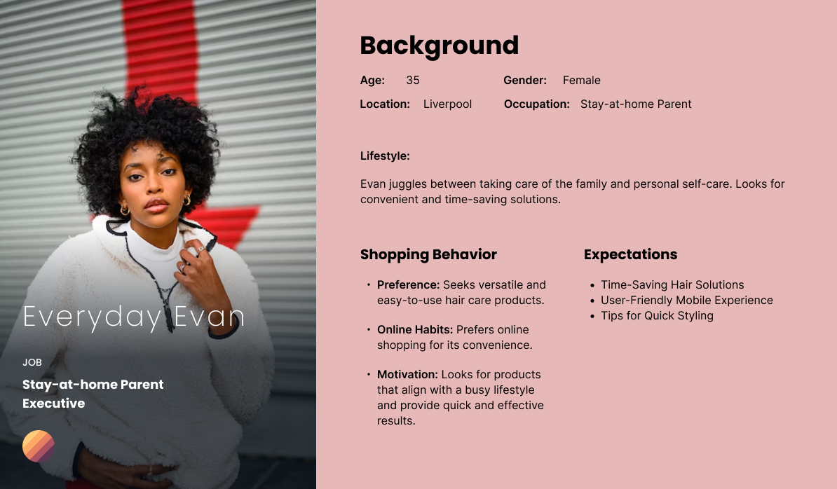
I conducted stakeholder interviews, user surveys, and competitive analysis to gain insights into Astute’s target audience and industry landscape. This informed our content strategy, design decisions, and feature prioritization.
In addition to stakeholder interviews, user surveys, and competitive analysis, we delved into an in-depth examination of Astute Business Consult’s competitors, including McKinsey and Bain. This comparative analysis provided valuable insights into industry trends, best practices, and areas for differentiation. By understanding the strengths and weaknesses of competitors’ websites, we identified opportunities to craft a unique and compelling online platform that resonates with both users and the company itself.
Features Implemented
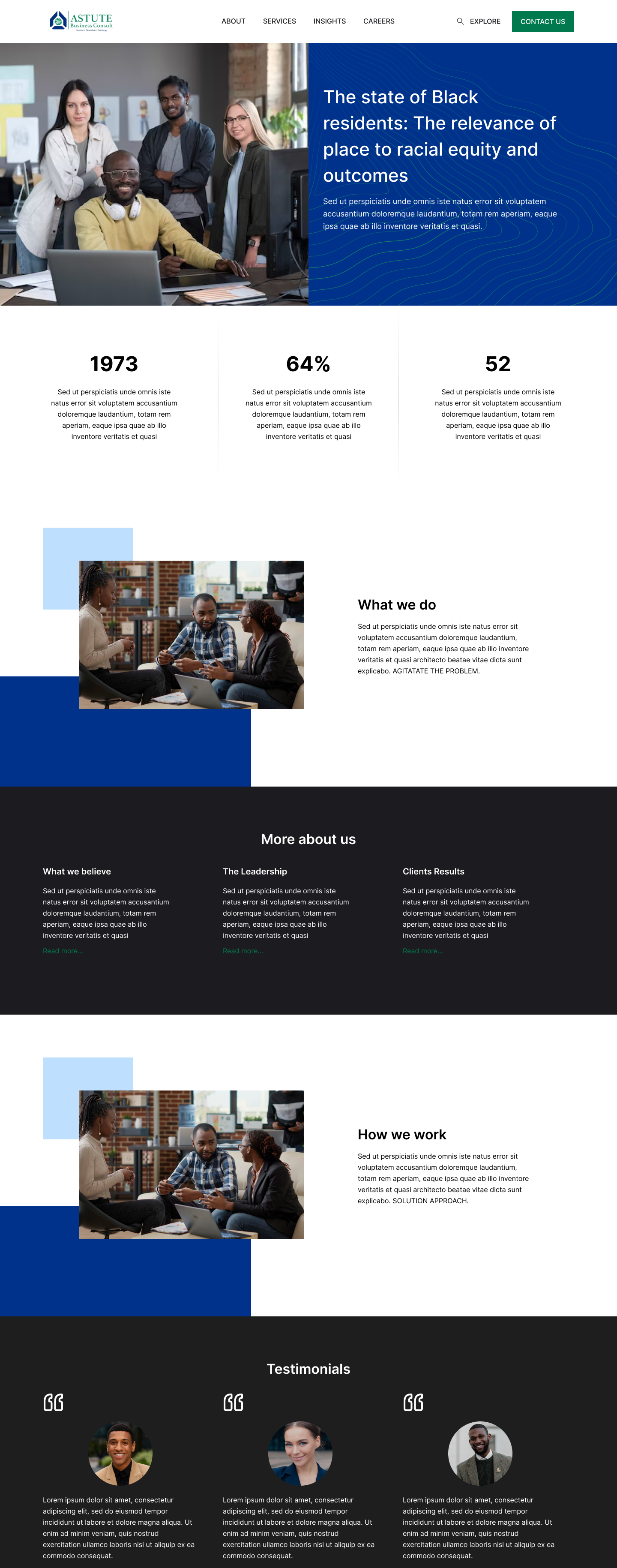
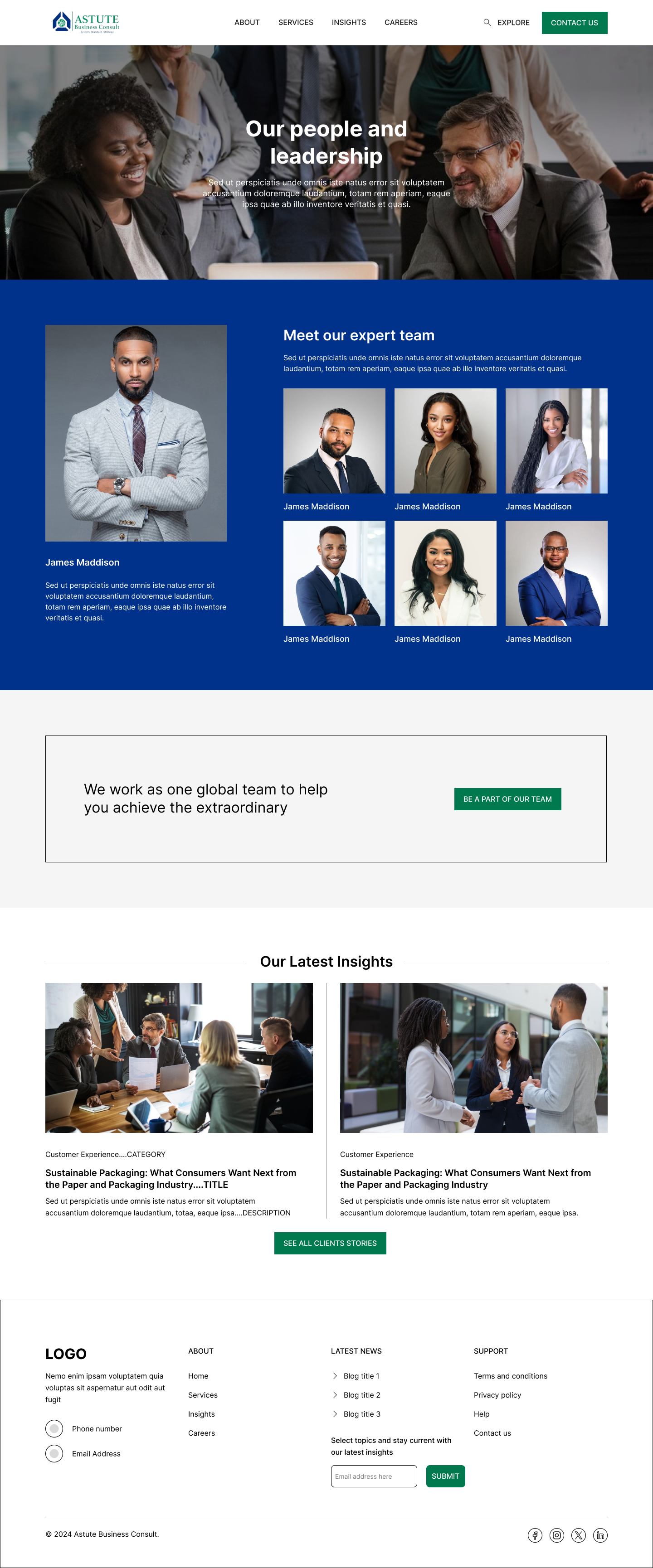
Building upon the findings uncovered during the research phase, we strategically implemented a range of features crucial for the success of Astute Business Consult’s online platform. These include:
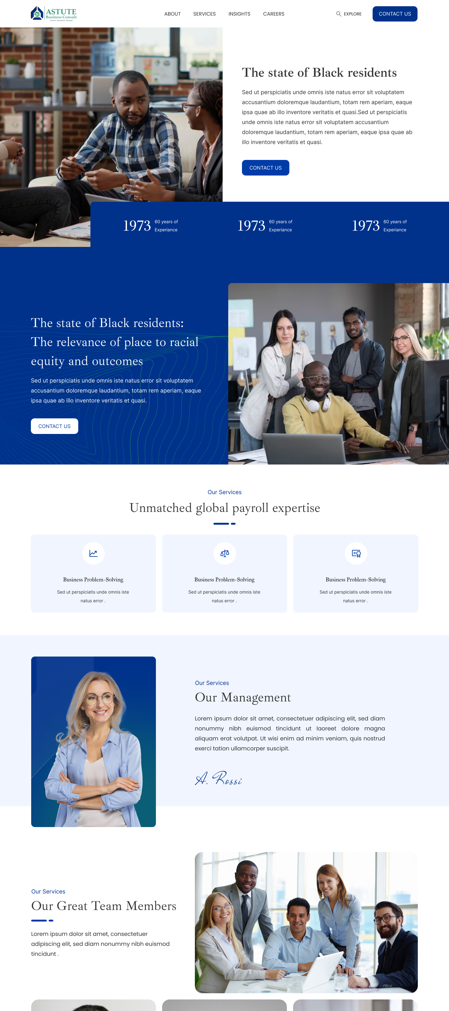
- Clear and concise business overview section.
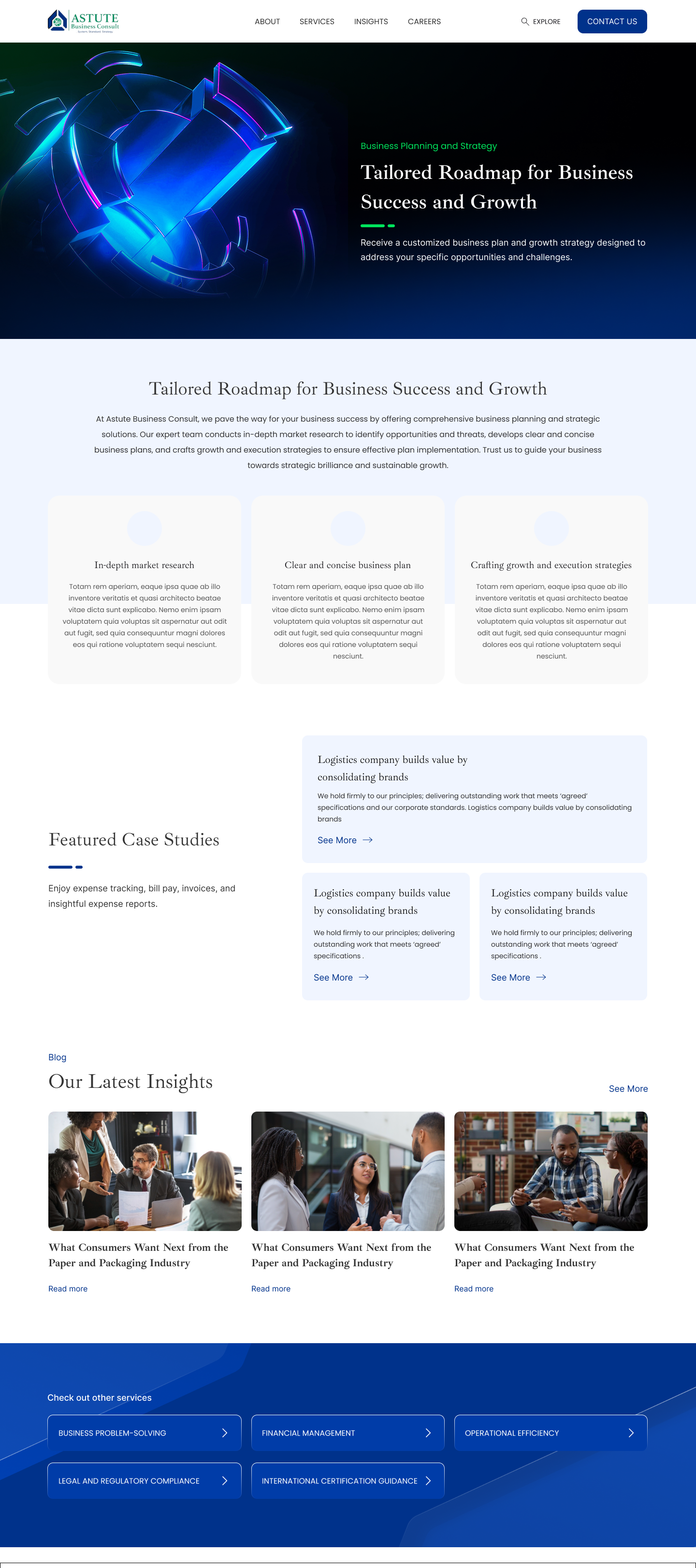
- Services and expertise showcased through engaging content and visuals.
- Lead capture forms and newsletter sign-ups for lead generation.
- Customer support section with FAQs, contact details, and chat feature.
- Blog/resource section for sharing valuable industry insights.
- Consistent design elements and messaging to reinforce brand identity.
- Mobile optimization for seamless access on smartphones and tablets.
Wireframe
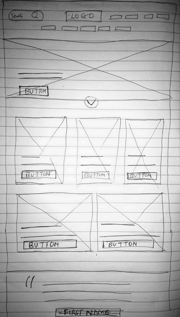
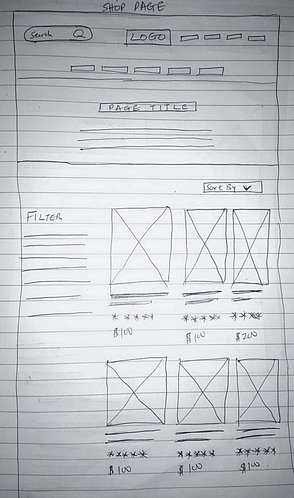
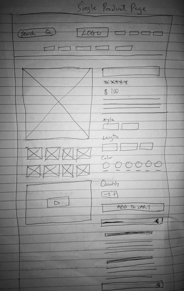
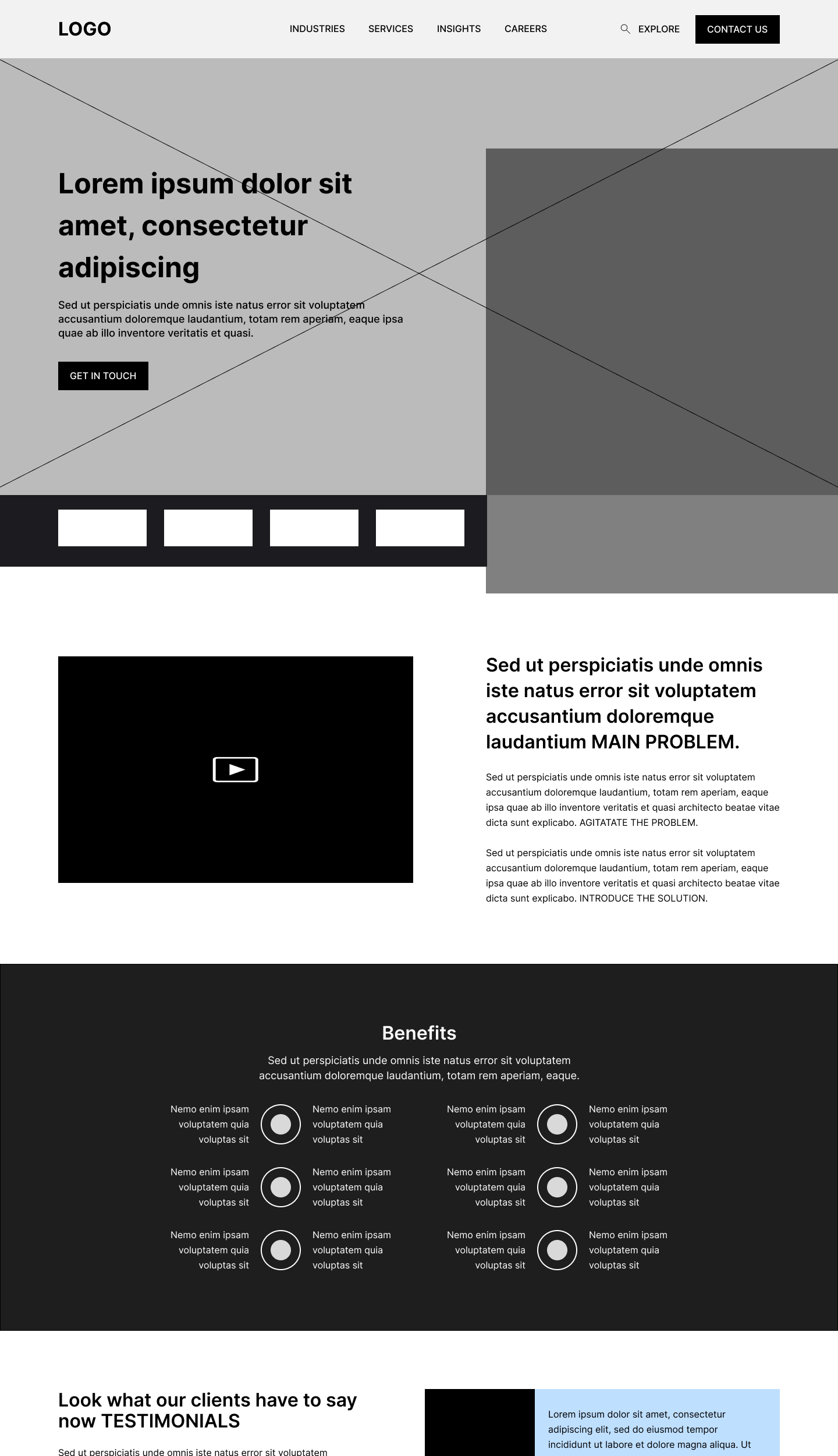
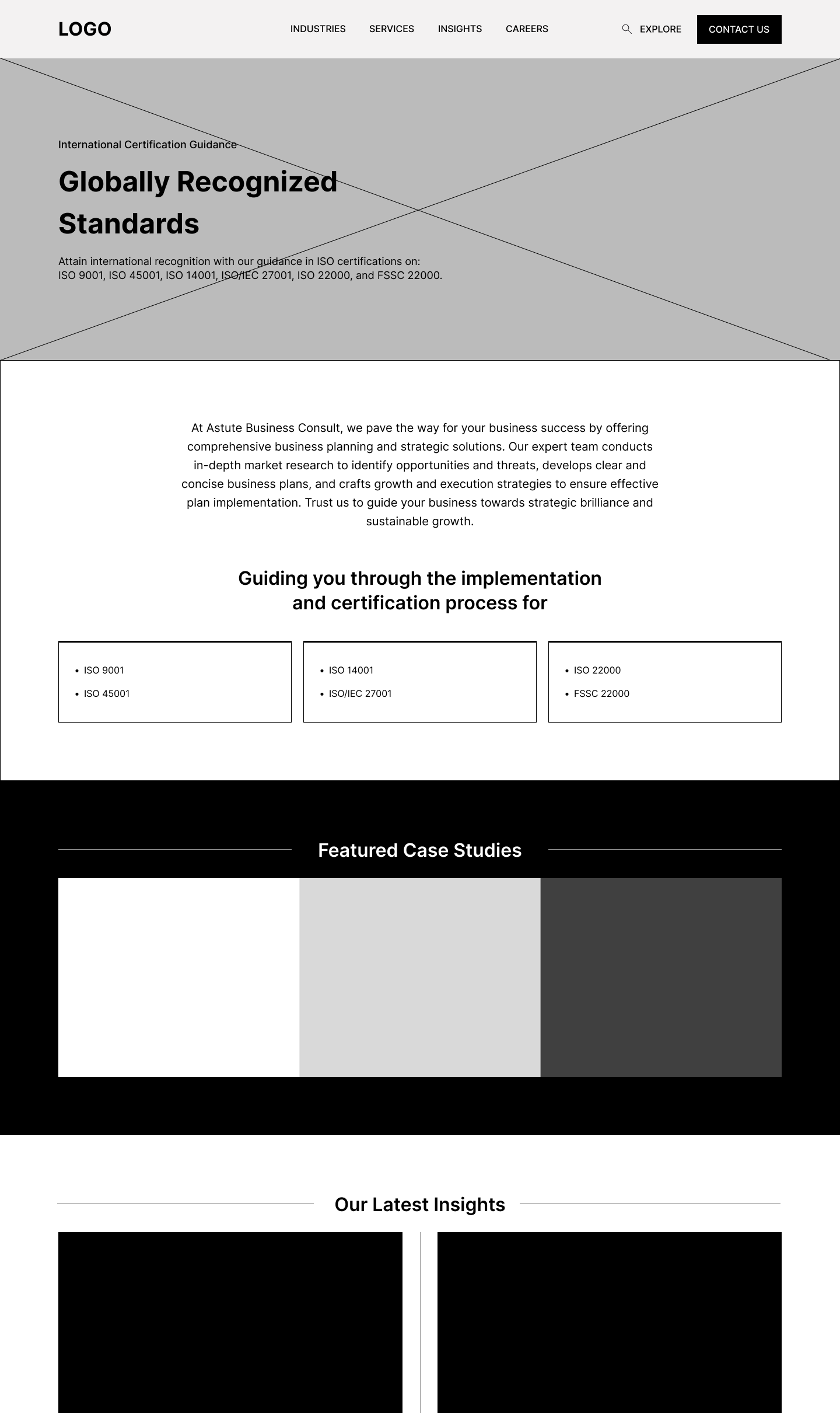
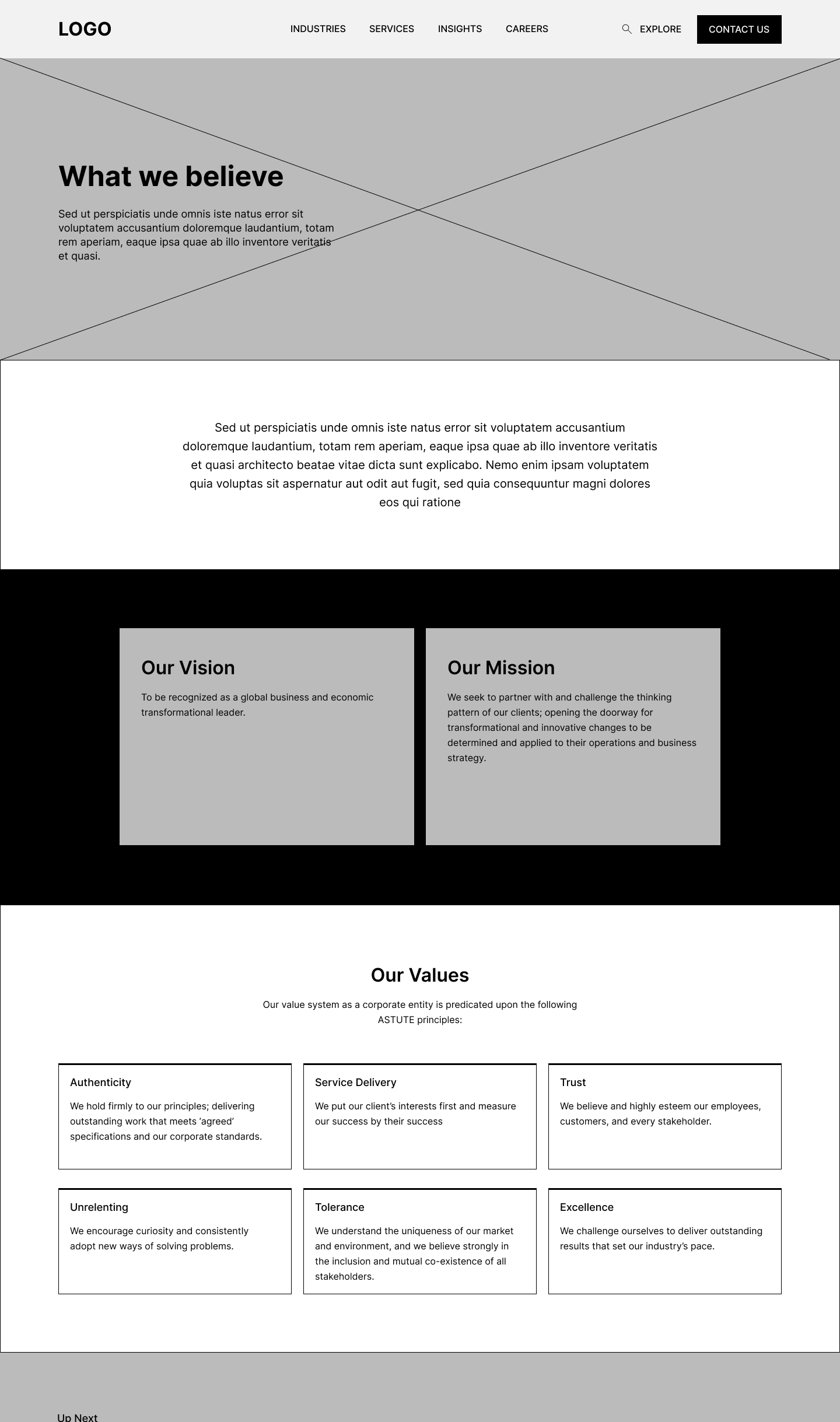
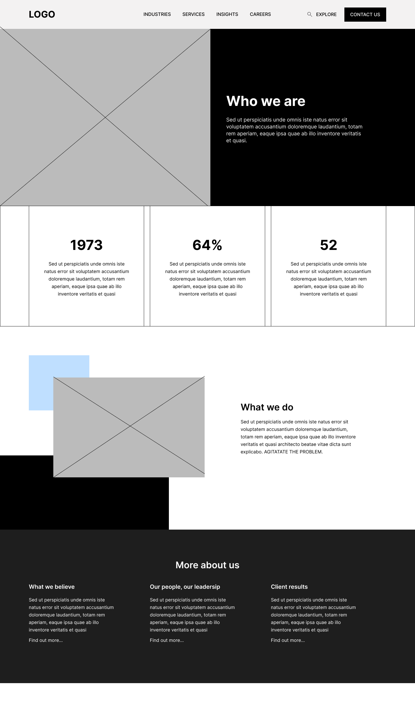
After drawing up a sketch of the website, I decided to create a visual representation to better communicate the layout, design, and interactive elements. Drawing the website allowed me to convey the envisioned user interface, ensuring a clearer understanding for both the design team and stakeholders.
Iteration and testing
I performed usability testing to gather both the client and user feedback, which proved enlightening. Through observing user interactions, identifying pain points, and collecting valuable insights, I detected emerging trends. More so, the client wasn’t too happy with the design. So, I utilized this information to implement changes in my designs.
Visual System
Colors
The chosen color palette for EleganceLocks embodies sophistication and versatility. A harmonious blend of muted tones and accent colors creates a visually pleasing and cohesive aesthetic. Soft neutrals convey elegance, while subtle pops of accent colors inject vibrancy into the visual landscape.

Typography
The selected fonts strike a balance between modernity and elegance, ensuring readability while exuding a sense of refinement.

Clickthrough Prototype
Results
Despite the website being in the development stage, preliminary testing and feedback have already yielded promising results. User engagement metrics, including time spent on site and page views, have shown a notable increase compared to the previous website version. Lead capture forms and newsletter sign-ups have garnered significant interest, indicating a strong potential for future lead generation. Additionally, the intuitive navigation and user-friendly interface have received positive feedback from testers, suggesting improved user satisfaction and interaction. These early indicators bode well for the success of the website upon its full launch, foreshadowing increased brand visibility, engagement, and lead conversion for Astute Business Consult.
Conclusion
The website redesign project successfully achieved Astute Business Consult’s objectives of establishing a professional online presence, engaging visitors effectively, and capturing leads. Through strategic design and development, we delivered a user-centric platform that positions Astute as a leader in the business management consulting field.
Lessons Learned
Comprehensive Research: Conducting thorough research, including stakeholder interviews, user surveys, competitive analysis, and competitor website evaluations, is essential for gaining valuable insights and informing strategic decisions throughout the project.
Iterative Design Process: Embracing an iterative design process allows for flexibility and adaptability, enabling continuous refinement based on user feedback and testing results. This iterative approach ensures that the final product meets user needs and business objectives effectively.
Collaboration and Communication: Effective collaboration and communication between stakeholders, designers, developers, and clients are critical for project success. Regular updates, feedback sessions, and transparent communication channels facilitate alignment and ensure that everyone is on the same page throughout the project lifecycle.
User-Centric Focus: Placing a strong emphasis on understanding the needs and preferences of the target audience is paramount. Designing with the end user in mind ensures that the final product resonates with its intended audience and delivers a positive user experience.
- Flexibility and Adaptability: Remaining flexible and adaptable throughout the project allows for adjustments to be made in response to changing requirements, feedback, and insights. Embracing a mindset of continuous improvement enables the team to address challenges and seize opportunities effectively.
Challenges Encountered
Rejection of Initial Design: I faced the setback of having to restart the redesign process after the client rejected the initial design, requiring me to invest additional time and effort into developing a new concept.
Managing Client Expectations: Balancing the need to communicate effectively with clients and their representatives while ensuring my concerns are heard without causing offense posed a significant challenge. I had to navigate delicate conversations and maintain professionalism to address issues constructively.
Scope Creep Management: Dealing with scope creep was challenging as additional features or changes requested by the client mid-project threatened project timelines and budgets. I had to diplomatically manage client expectations and prioritize deliverables to avoid scope creep.
- Design Consensus: Achieving consensus on design decisions among stakeholders proved challenging, as differing opinions and preferences sometimes led to delays and compromises. I worked to facilitate open communication and collaboration to reach agreement on design elements.

