
Spendwise App
Design
Spendwise App Design
Timeline
- One Month
My Role
As the innovator and sole designer for this project, I was responsible for the entire process, that is, the research, designing, wireframing, and prototyping. I designed the overall look and feel, including layout, typography, color, logo, and so on.
Tools
- Figma
- Miro
- Pen
- Paper
Overview
Spendwise is a state-of-the-art financial management app that has been meticulously crafted to empower users in their financial journey. It offers a user-friendly platform for tracking expenses, managing budgets, and cultivating savings habits. The app’s primary aim is to provide users with the tools they need to gain control over their finances, fostering financial wellness and long-term financial goals.
The problem
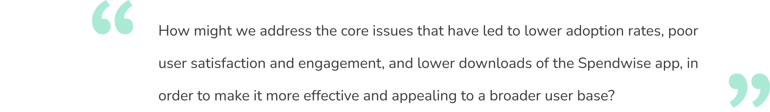
Despite the app’s initial simplicity, the app has not gained significant adoption or downloads in the market. Users have found the app lacking in features and functionality, and it faces tough competition from other financial management tools. To remain competitive and meet the evolving financial needs of users, Spendwise is looking to identify and address the core issues that have led to lower adoption rates, poor user satisfaction and engagement, and lower downloads.
Problem Statement
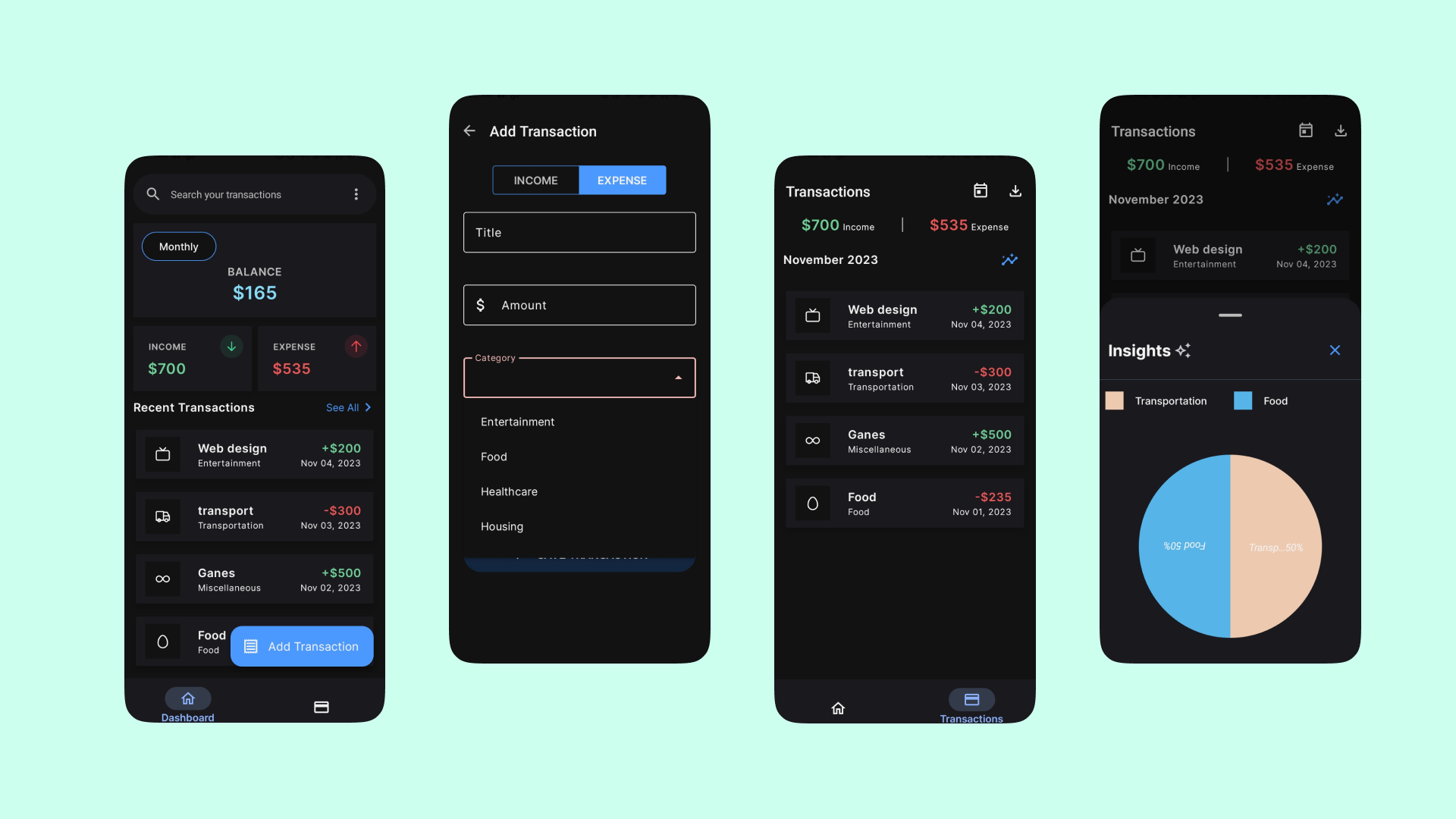
Spendwise App Old Mobile Interface
The Hypothesis
By redesigning the Spendwise app to incorporate additional features, enhance its user-friendliness, and offer compelling financial management tools, we can significantly improve user satisfaction and engagement. This, in turn, will drive increased user adoption and downloads, positioning Spendwise as a leading choice for empowering users in their financial journey.
The Goal
User Goals
- Financial Wellness: Users want to improve their financial well-being, make informed financial decisions, and work towards their long-term financial goals.
- User-Friendly Experience: Users seek a user-friendly app interface that is easy to navigate, intuitive, and doesn’t require a steep learning curve.
- Comprehensive Features: Users expect the app to offer a wide range of financial management features, including budgeting, expense tracking, savings planning, and more.
- Personalization: Users desire personalized financial insights and recommendations that are tailored to their individual financial situations and goals.
- Efficient Receipt Management: Users want the ability to easily capture and manage receipts to keep track of expenses.
Business Goals:
- Increased Adoption: The business aims to increase the number of users who download and actively use the Spendwise app to achieve higher market penetration.
- Improved User Satisfaction: Higher user satisfaction levels are essential for retaining existing users and attracting new ones.
- Enhanced User Engagement: The business seeks to boost user engagement within the app, leading to longer and more frequent usage.
- Competitive Edge: To compete effectively in the financial management app market and distinguish Spendwise from its competitors.
- Higher Downloads: The business aims to see more downloads of the app from app stores, indicating a growing user base.
Research
User Research
The primary goal of my research was to understand the users, their preferences, and pain points with the Spendwise app as well as identify areas of improvement in the app. I wanted to uncover their motivations, frustrations, and specific use cases. I employed a mix of qualitative and quantitative research methods, including user surveys, interviews, diary studies, and usability testing.
About 50 surveys were distributed through email campaigns and social media & they included questions about users’ demographics, financial habits, motivations for using Spendwise, and their experiences with the app. I also asked for feedback on specific app features & requested their recommendations on things to improve upon. During one-on-one interviews with 5 participants, I asked open-ended questions to encourage them to share their experiences freely. I encouraged them to discuss specific scenarios where they interacted with the app. Using usability testing with 5 participants, I watched them as they interacted with the current interface of the app. The participants were asked to think out loud. I noted their reactions and pain points as they used the app.
Here’s what I found:
Users expressed confusion about the app’s purpose until they reached the home screen.
Many users found it frustrating that the app was inaccessible offline.
Users wished for the ability to create custom expense and income categories.
Some users requested a light mode version of the app, highlighting the importance of customization options to suit individual preferences.
Users often had specific scenarios in mind, such as family budgeting, income goal setting, and investment planning.
Around 70% of users were dissatisfied with the app’s chart features.
User engagement with the app was inconsistent, often diminishing after making downloads. Users cited forgetfulness or time constraints as reasons for this inconsistency.
Users expressed a strong desire for proactive notifications to assist them in setting and achieving financial goals.
Competitive analysis
In my quest to redesign Spendwise, I also embarked on an expedition to explore the competitive landscape. I wanted to understand how Spendwise compared to three key competitors: MS Excel, iSaveMoney, and Wallet app.
To perform a comprehensive comparison, I used the competitive analysis canvas to consider several key factors such as mission/vision, products/services, business model, company size, finance & profitability, customer segments, price, culture, customer base, customer experience, and unique value proposition.
Our competitive analysis yielded the following insights:
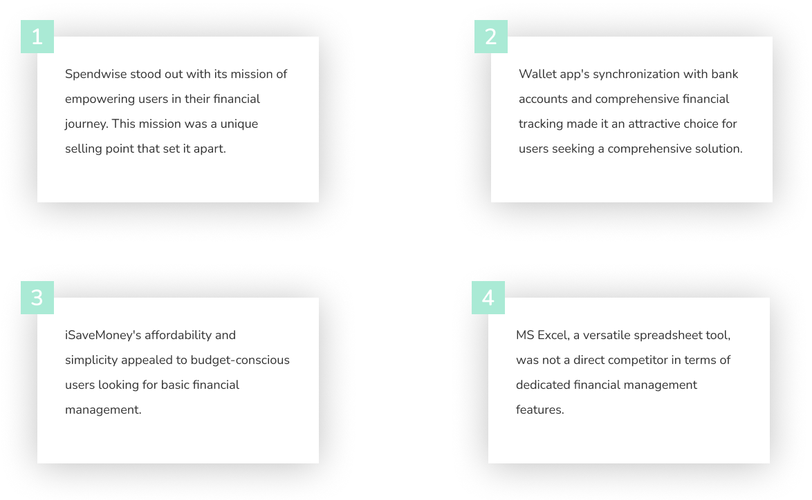
Lastly, I gathered tremendously helpful insights by analyzing their products features and reading the reviews on these apps. I wanted to discover what appeal to users as well as discover features that they were making.
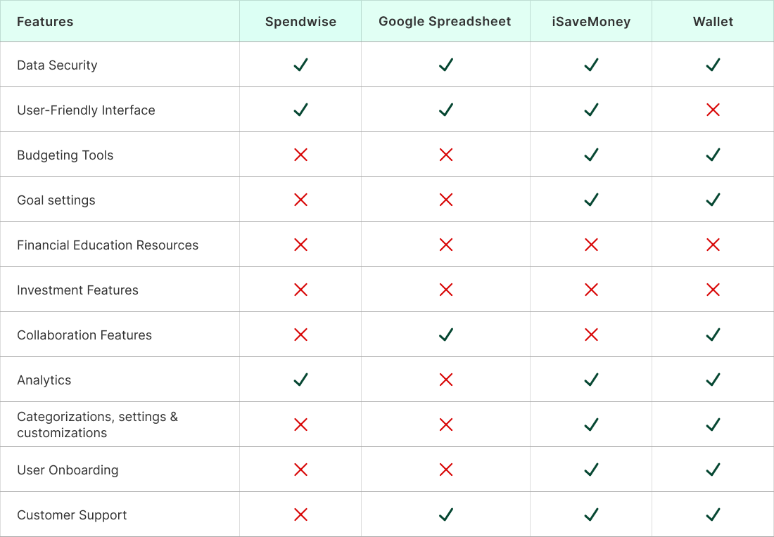
Other features include:
Spendwise: Account history
Google Spreadsheet: Manual settings
iSaveMoney: Labels, Bank reconciliation and linkage, merge budgets, estimator tool, account history.
Wallet: Dark mode, Notifications, Bank reconciliation and linkage, account history, planned payments, debts section, wallet for the business, shopping lists, warranties, loyalty cards, currency rate checker, referral program, Account history
Designing the solution
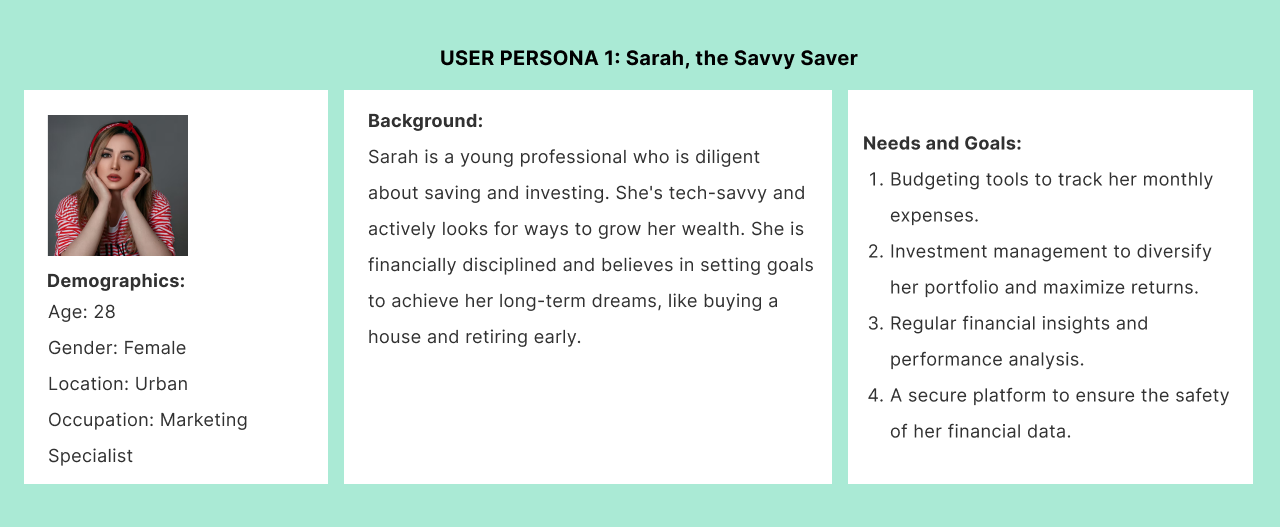
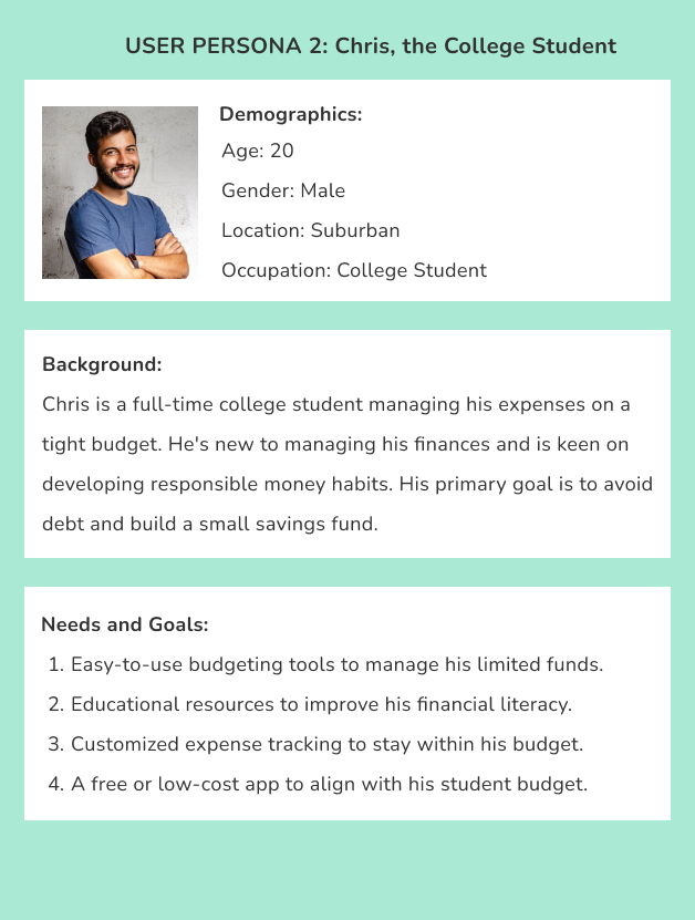
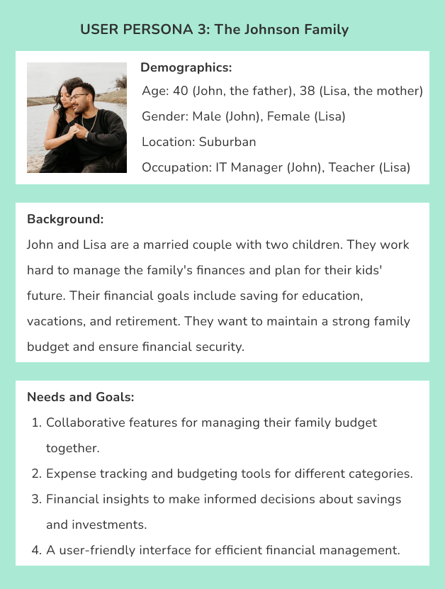
User Persona
Prior to commencing the design process, we conducted an in-depth analysis of our users’ existing behavioral and purchase data to gain a deeper understanding of their preferences. Additionally, we carried out a series of customer interviews.
Our primary emphasis was on pinpointing the specific tasks for which our customers utilize our product. We established three distinct user personas and correlated them with the specific tasks they aim to accomplish.
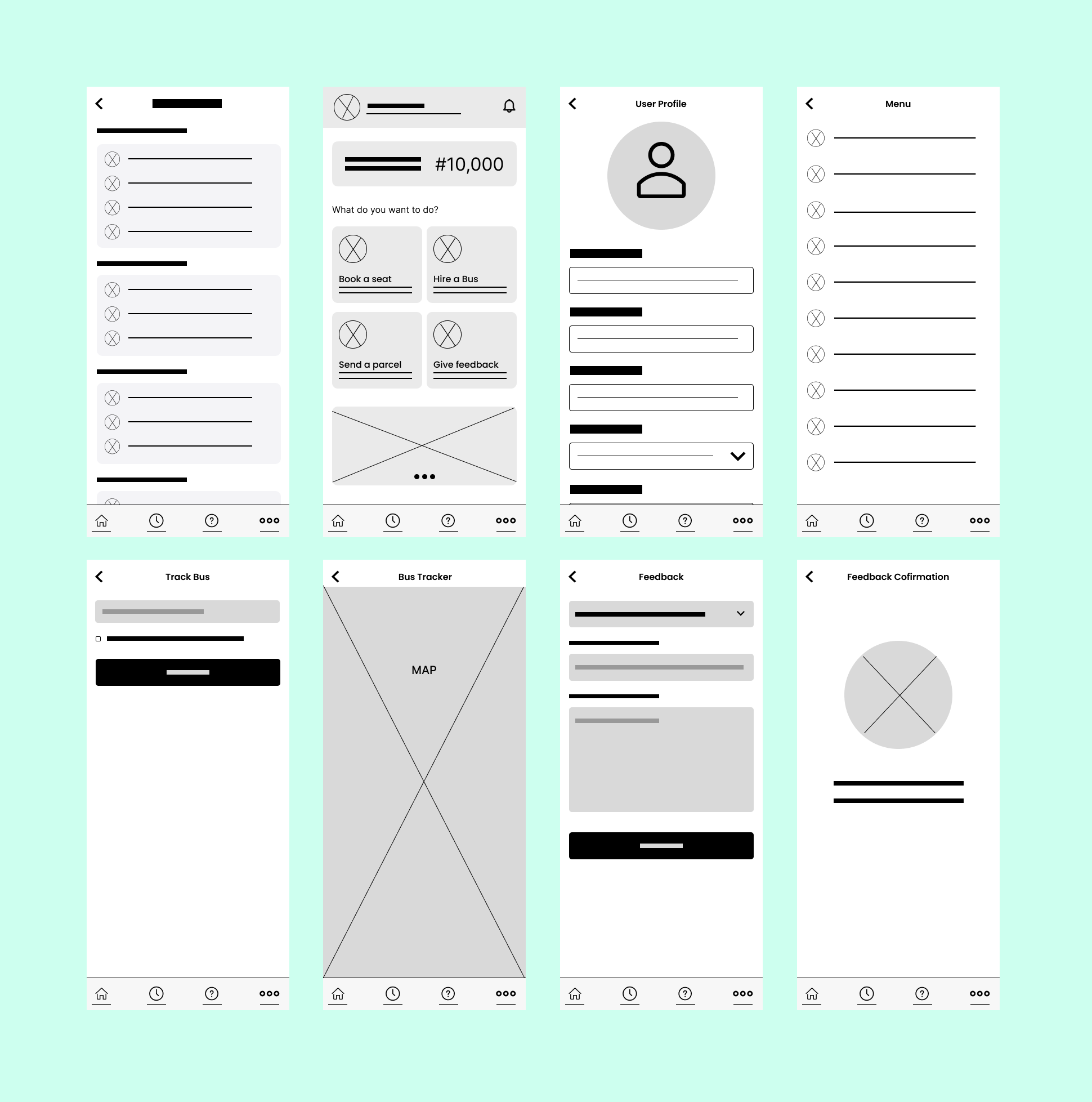
Sketches
Digital Wireframes
With a map in hand and ideas swirling, I began to sketch the future. Brainstorming sessions brought forth innovative solutions. From my sketches, I quickly mocked up some basic digital wireframes to gather feedback from some users and other engineers on the overall layout and structure of the solution.
Competitive analysis
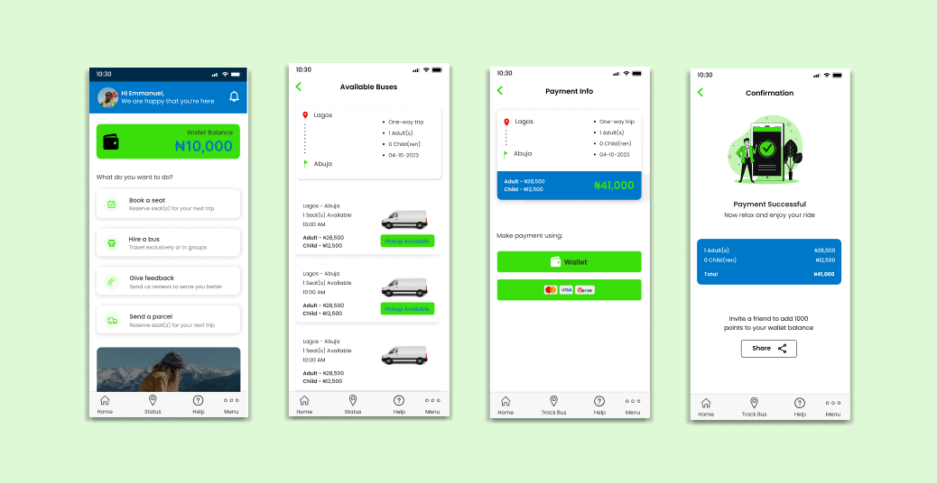
I coverted these digital wireframes to HI fidelity mockups. This allowed for comprehensive user testing, refined design aesthetics, and effective communication with stakeholders. Below, are some key design solutions and concepts, along with the rationale behind these decisions.
Testing and Learning
After the intensive design phase, it was time to bridge the gap between our prototypes and a user-centered, high-quality app. As such, I conducted usability testing to get users feedback. About 10 participants were introduced to the prototypes. They were encouraged to think aloud and share their thoughts as they interacted with the interface, simulating real-life usage.
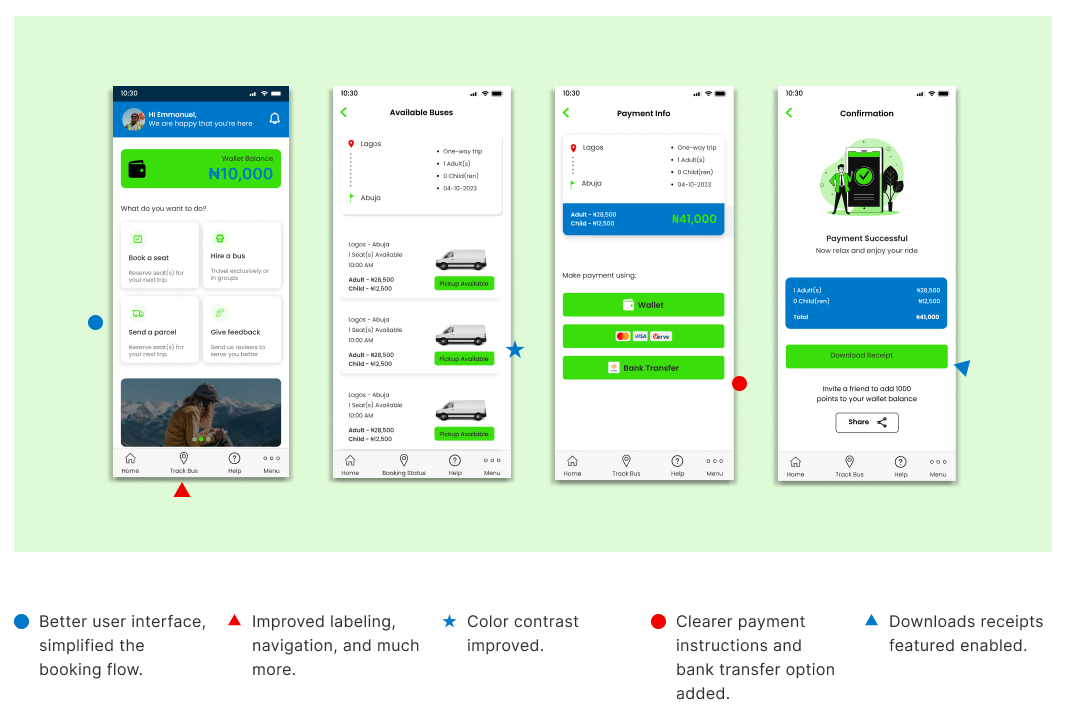
Iteration and Refinement
The testing sessions were an eye-opener. I observed users’ interactions with the app, noted their pain points, and collected valuable feedback. Several trends and insights began to emerge. From the information received, I then went ahead to apply changes to my desigs.
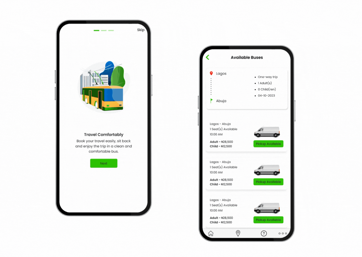
Hi Fidelity Prototypes
Final Designs
Results
I reached back out to the designers I interviewed in the beginning to test out the prototype and give their feedback. Here are the responses I received:
- “I found the new budgeting feature incredibly intuitive and user-friendly. It’s a big improvement. However, the dark mode didn’t sit well with me. I prefer the light mode for better readability.”
- “The custom categories feature is a game-changer. It allows for personalization that was previously missing. I also appreciated the educational resources; they provide valuable insights. However, the onboarding could be more engaging for first-time users.”
- “I liked the idea of bank integration; it’s a step toward simplifying the expense tracking process. But the security concerns need to be addressed transparently. Also, the proactive notifications for financial goals are spot on.”
- “The chart features have improved significantly; they are more visually appealing. However, the lack of offline mode is still a drawback, and it’s crucial to cater to users with intermittent internet access.”
- “I was quite impressed with the option to set financial goals. It gives the app a long-term vision. But I think more could be done with data visualization and analytics. Users would benefit from more comprehensive insights.”
Challenges & Lessons Learned
The TravelEasy Express project provided me with valuable insights and lessons that have enriched my understanding of UX design and project management. Here are the key lessons learned:
- Prioritizing user needs and preferences is at the core of successful design.
- Understanding our users’ pain points and designing solutions around them is paramount.
- Iteration Leads to Improvement. Continually seeking feedback and making incremental improvements can lead to significant enhancements.
- Flexibility is key when dealing with complex projects. The ability to adapt to changing requirements and unforeseen challenges is critical for success.
- Effective collaboration among team members, stakeholders, and users is vital. Clear and open communication ensures everyone is aligned with project goals.
Conclusion & After-thoughts
This Case Study presented me with challenges, but the journey has been incredibly rewarding. I’ve nurtured this app concept for more than a year, and now, as a UX/UI Designer, I’ve transformed it into a tangible reality. Crafting this app from the ground up served as an enriching learning experience, allowing me to grow as a designer and researcher. Witnessing how the app resonated with its intended users and met their needs has been genuinely gratifying. Throughout this project, I set high standards for myself, committed to consistency, and maintained a keen focus on the details.
Looking ahead, my plans include expanding the app’s feature set and capabilities, including:
- More sophisticated investment options.
